Redesigning Evangadi

I thought I have to go back and see the first sketch
Project name - Evangadi
Project client - EvangadiTech
Project date - June 2019
Overview
Evangadi Networking is an online networking company that works on Technology and helps thousands of people to be networked, share information and become a platform in the IT industry. It is a network formed by people who believe in the power of collaboration with a common goal of nurturing one another to grow together.
Goal

-
To design a meaningful and well functioned mobile app
-
To have more customers by creating a better platform
-
Be a better competitive in the industry
-
Identify pain points to design a better user experience
-
Align company goals with customer needs
-
Help users to use the app from any location
Deliverables
-
Research
-
Defining the problem
-
Fully-detailed journey map
-
Wireframes
-
User-interface designs
-
High-fidelity mockups
-
Prototype and test
My role
I am one of the three designers and engineers who came up with the solution to create a mobile app for Evangadi networks.
I led the designing of Evangadi Networks app.
Up until today, I led efforts to evolve the service and address customer pain‐points related to the app and discovery experience, providing feedback, like mark ups and commenting, is a key used case for collaboration. I lead the redesign to extend our feature set to allow users to create better user journey.
Aim of the project
This project aims to create an app design for Evangadi Networks, in supporting and reaching the company goals which helps to satisfy the customer needs based on their own experience and adaptation.
The main aim of this project is to create user friendly app that is simple to use and can help users to use the site wherever they are using their mobile devices.
Simplicity, user-friendly and usablity are among the priorities of the design process to satisfy target group users.


Understanding the problem
Users are frustrated using the website in their mobile devices, this leads users to stop using the website.
The current website is not a user friendly in terms of its interface and the designing elements where Evangadi loses its users. How could we increase engagement and promote the feedback loop?
The interface of the web design is one issue that needs to be designed including its functionality.
Most people fail to use the website appropriately since the website didn't match with their experience. Informations are not capt in group and by order, there are too too much information.
The website voice and personality is not well defined.
Users could not complete their task using the website, and thus were leaving to complete their workflows. Evangadi is losing users.
It is difficult to give and receive feedback, edit, and track changes in the content.
These had all been customer comments in our backlog, while users collaborate with their teammates and provide feedback. This created an annoying back-and-forth process for users who simply use the website to retrieve any information they need.
Assumptions
It is assumed that the problem could be solved by designing a better landing page. Simple usage of button text and other elements will attract users.
It is assumed that improving and sustaining the experience for user will help the business. Consistency through the app will create better flow through the app. Interactive design helps users to follow their experiences in creating a better outcome.
Well organized information architecture will help to improve the app.

The approach
In favor of speed, we were tasked to design and build Evangadi within the a new architecture. Following the assumption to broaden the user experience in creating the app. To make customers to be familiar in the existing infrastructure. Focusing to get more customers by adding a convenient way of using their mobile devices. Using the architectural design decisions which had a major impact on the quality of customers experience which will be created.
The biggest challenge I faced throughout this project was balancing with designs, while collaborating with the team. Since this project touched every part of the app.
Our team spent a large amount of time debating in design decisions, and feedbacks which brought us for a better design solutions.
We invested time into creating documentation, saved a lot of back‐and‐forth as the project progressed.
Devotions was the approach we use in sustaining and developing our team's spirit. Design principles and the content prioritisation framework helped to create visibility into my decision‐making process.
Target audience
The target audience for this project is mostly ages 21- 45.
Primarily based in the United States.
People who wants to network with others.
People who are actively involving in the Technology fields and who wants to switch carriers.
Ready to meet new people and people who are busy in their jobs and feels lonely.
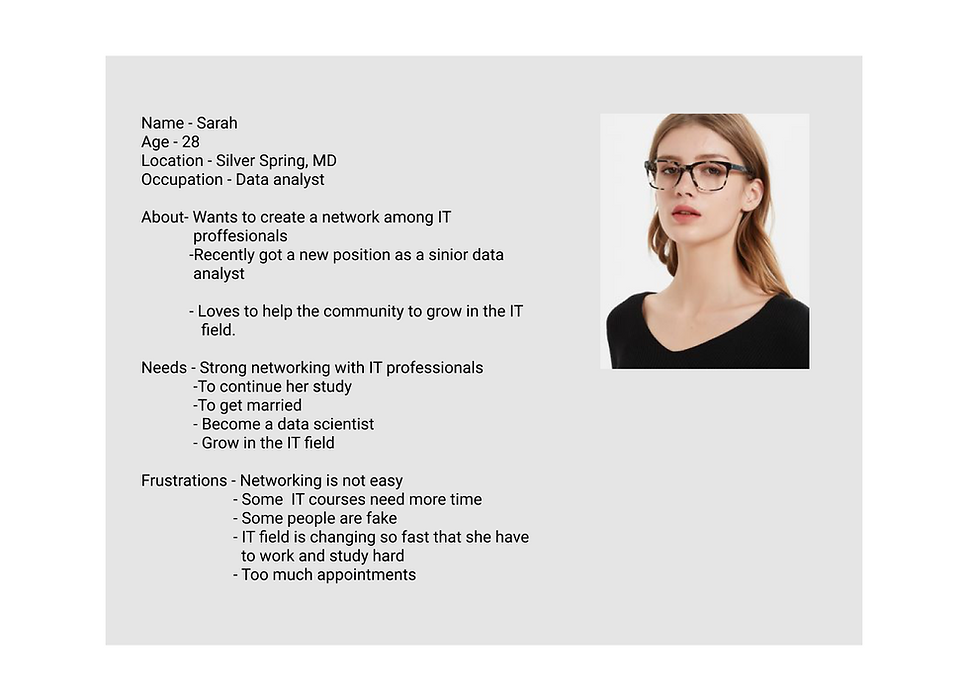
Persona
Emphaty map

Journey Map

Storyboarding/Studying persona

Affinity diagram

Creating relationship
As the aim of the website creating deeper relationships among customers, product users are key factor for the apps development.
Our task is to evolve with customers needs and enter the highly competitive market that is greatly available in the U.S.
With this new app design we hoped to create deeper relationships among Evangadi Network users.

Wireframing the solution
Based on the above problem identified, i worked towards addressing these pains by creating potential solutions. I quickly mocked up some basic wireframes to gather feedback, and to know the functionality of the app. This involved not only wireframing and mockups but also prototyping where it is for ready for a usability test to established standardize visual hierarchy and layout for future components.
Sketches


Wireframes


Testing the design before investing money and time is what a designer have to be careful. When our team have prototype ready for use, we knew we needed to put it in the hands of our customers.
We conducted guerrilla user testing which helps us to identify all the gap and the missing elements and helped us highlighted the top risks in the product.
Testing helped us to create a performance and stability in the app that we discovered during our design testing. Testing brings a solutions to the of usability issues. This is a time to know which critical features were missing.
Testing
Mockups


Accessibility
Accessibility is inclusive design. Designing accessibility in mind is the power of better design and it removes barriers to empower all users to be productive and connected. In accessible design whether it is permanent, temporary or situational disability all are experiencing limited mobility. I have put all the necessary effort to make the product accessible by people with disabilities and also by all equally. I have created the design elements and content of the app using the web content accessibility guidelines (WCAG) to the best of my knowledge to make it perceivable where people can see and hear the content, operable where people can use the product by type or voice, understandable where people can get clear and simple language, robust where people can use different assistive technologies. I have used text size, clear color contrast, focus state, grouping similar items, and multiple visible indicators to make the product accessible by everyone. After all inclusive design is simply a good design.
Outcome
-
Delivered a polished prototype which was used to demo to Evangadi network board members
-
Thanks to close developer collaboration the client is satisfied
-
Able to achieve the project goal
-
Created usable design solutions
-
True satisfaction
There is a saying that design decisions are tools for a functional user experience design for a better product.
Throughout this project, I observed how important is to discuss with the team members for better product delivery.
I learned to define quality.
In learning the best design solution we asked “are we building the right thing?”, to answer how we could continue in create meaningful design solutions.
I learned that Launching a product Is only the beginning, there are other stapes even after launching a product or a service.
I asked myself if I am proud of launching Evangadi networks app? I am decently proud of what I did even if I know I am still learning from the ongoing project.
I learned to value simplicity and focus on utility. Craftsmanship and carefully thought out details are what I have also learned. learned to truly value helping people in what abilities and knowledge that I am happy to create meaningful moments in people's lives.
I am proud that launching this product needed to happen in order to help users to create meaningful network among their community and above.
I believe that my design skills gives me wisdom, which is only possible with the entire team in a position with accompanying collaboration to learn.
What did I learn
