Qena
A Redesign Approach to Digitization in Finance and Banking

Project name - Qena
Project client - Qena.ai
Project Overview
The goal of this project was to redesign a scalable web-based platform that enables banks, microfinance institutions, and individuals to seamlessly access, manage, and monitor digital lending operations.
My role
I led the redesign of the platform’s dashboard experience, information architecture, and onboarding flows to create a system that works for both institutional administrators and individual borrowers.For this particular project i am one of the four designers. I was a part of the design team in developing user research, interaction, working on the visual design, wireframing and prototyping. As we collaborate as a team on this particular project I have involved in all of the design processes.
Background
Qena is a Digital Lending fintech company and banking platform as a service infrastructure provider. Qena B/PASS is an AI-driven Banking Platform as a Service designed to empower financial institutions with digital lending infrastructure.
Qena is an AI data-driven fintech infrastructure provider focused on digital lending. The platform supports uncollateralized credit offerings through advanced credit scoring and psychometric data modeling.
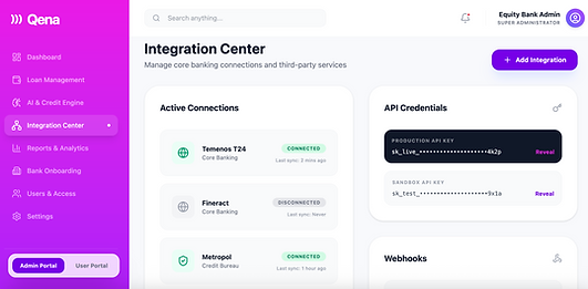
Qena partners with financial institutions to bridge financial gaps for underserved populations, including MSMEs, smallholder farmers, and individuals. Its Banking Platform as a Service (B/PASS) enables banks to streamline digital lending processes, automate risk decisions, and scale inclusive finance operations.
The design process
We started the design process by studying the whole applicatin needs to find out the most important elements to redesign. Researching and studying busness goals and users experience to create a solution to all the gaps. We aim to incorporate the key phases of discovery, definition, ideation and implementation in all of our project process.
Understanding the problem
During the product audit, several critical usability and structural issues were identified:
-
Poor information architecture with unclear grouping of elements
-
No clear separation between Admin and User dashboards
-
Same onboarding flow for banks and individual users
-
Lack of adaptive interface for different user types
-
No search functionality
-
Inconsistent branding and visual language
-
Low-contrast themes affecting accessibility
-
Complex, data-dense layouts overwhelming non-technical users
The experience lacked hierarchy, clarity, and role-based logic, making it difficult for both financial institutions and borrowers to navigate effectively.

Target audience
1. Financial Institutions (Primary B2B Audience)
The core audience includes banks, microfinance institutions, and fintech lenders seeking to digitize and modernize their lending operations. These organizations require secure, AI-driven tools to streamline loan origination, automate credit scoring, manage risk, and integrate with existing core banking systems. Their goals include improving operational efficiency, expanding financial inclusion, reducing default rates, and scaling digital lending services sustainably.
2. Small Businesses & MSMEs
Small and medium-sized enterprises (MSMEs), including entrepreneurs and smallholder farmers, represent a key borrower segment. These users often face barriers to traditional credit due to lack of collateral or limited financial history. They need accessible, transparent, and fast digital lending solutions that provide fair credit assessment, clear repayment tracking, and financial insights to support business growth.
3. Individual Borrowers
Individuals seeking personal or micro-loans form another critical audience. This includes underserved or underbanked populations who require simple, trustworthy, and easy-to-navigate financial tools. Their needs center around clarity, transparency in loan terms, accessible onboarding, and ongoing visibility into repayment progress.

Prioritization of Issues
Issues were prioritized based on impact and frequency:
-
Information architecture restructuring
-
Role-based dashboard separation (Admin vs User)
-
Onboarding redesign
-
Search and navigation improvements
-
Accessibility and contrast fixes
-
Visual consistency and brand alignment
-
Adaptive layout optimization
The focus was first placed on structural clarity before visual refinement.
User interviews
We conducted user interviews to dive deeper into the needs of wide range of people, including target users who use banking services on a daily basis and potential users who are interested in lending money from financial service providers including peoples who haven't tried it yet. By learning about their motivations, frustrations, and needs, we were able to gain user insights.
Collecting information
The most important part in collecting information is from the business side and user gives you. After collecting the recordings from the user interviews, and available data I conducted affinity mapping with my teammate to synthesis the pain points identified. We have sort out to group the gathered information needs work. We grouped these problems under common themes and features in the platform.
Solution

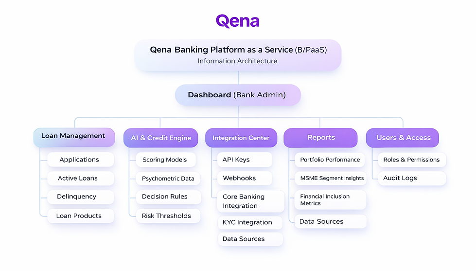
Information Architecture Redesign
I restructured the platform into clear role-based environments:
-
Bank Admin Portal
-
Individual User Portal
Each dashboard was designed around its core objectives:
-
Admin: Portfolio monitoring, risk management, integrations
-
User: Loan tracking, repayment, financial overview
Separate Onboarding Flows
Created tailored onboarding experiences:
-
Institutional verification & API integration for banks
-
Credit profile & loan application setup for individuals
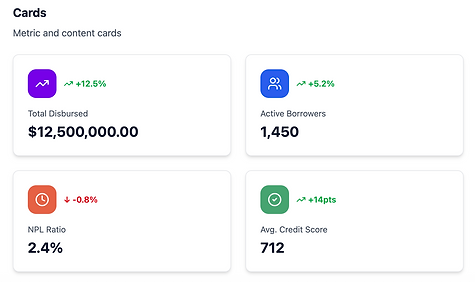
Dashboard Optimization
-
Introduced modular KPI cards
-
Clear risk indicators and status tagging
-
Search functionality in top navigation
-
Data grouping through progressive disclosure
-
Simplified loan progress visualization
Adaptive Interface
Designed scalable layouts to support:
-
Data-dense enterprise use cases
-
Simplified views for individual borrowers
Visual & Brand System
Developed a consistent fintech visual language:
-
High-contrast accessible palette
-
Structured spacing system
-
Unified typography scale
-
Modern AI-forward aesthetic
6. Challenges
-
Balancing enterprise-level complexity with user simplicity
-
Designing one system that supports both institutional and individual mental models
-
Making data-dense financial dashboards approachable
-
Ensuring scalability for future integrations and AI modules
The biggest challenge was reducing cognitive load without oversimplifying critical financial data.
User persona

Information architecture
Design System
Styleguide link


Icons


Spacing

Typography


Color palette and Typography


.png)


Wireframing
Before creating the wireframes we as a team discussed on the potential pain points and the potential problem to solve. Based on the problems identified, I worked towards addressing these pains by coming up with potential solutions. Which includes on the wireframes below by reducing the number of steps to minimize time to completion, creating a connection with selected applications, establishing clearer visual hierarchy by grouping related fields, a standardized styling and UI pattern for future wizards that I quickly mocked up some basic wireframes to gather feedback from product users.
Admin Dashboard
Home

Loan Management

AI Credit Scoring

Integration Center

Loan application detail

Bank Onboarding

User Dashboard


Visual design
The visual design was developed by iterating from mood boards and style to the UI kit and finally to create a consistent color, typography, image style, symbols, branding and other forms of the visual element inside the product. Since the visual design is the main part where users interact, with we give emphasis in ideating the design flow in line with the users needs.
We give priority to consistence and sound of the design. Each element in the design is equally important when it comes to the visual design process therefore we balance all the visual elements as they should be.
The visual direction reflects trust, intelligence, and innovation:
-
Clean left-sidebar navigation structure
-
Strong hierarchy through spacing and typography
-
Clear risk status indicators
-
Interactive progress visualization for loans
-
Modular dashboard components for scalability
The purple gradient accent reinforces Qena’s innovative AI-driven positioning while maintaining financial credibility.
The visual design was developed by iterating from mood boards and style to the UI kit and finally to create a consistent color, typography, image style, symbols, branding and other forms of the visual element inside the product. Since the visual design is the main part where users interact, with we give emphasis in ideating the design flow in line with the users needs.
We give priority to consistence and sound of the design. Each element in the design is equally important when it comes to the visual design process therefore we balance all the visual elements as they should be.
Validation included:
-
Internal stakeholder walkthroughs
-
Usability testing on dashboard navigation
-
Role-based scenario testing (Admin vs Borrower)
-
Accessibility contrast checks
-
Iterative refinement based on feedback
Focus was placed on:
-
Time to complete tasks
-
Error reduction
-
Ease of navigation
-
Comprehension of financial metrics

Mockups
Admin Dashboard


User Dashboard


Outcomes
With the ambition to create a solution that can be adopted by banks, integrate sustainable development goals into social impact, and bring financial institutions closer to underserved communities, this redesign established a scalable digital infrastructure.
The final result:
-
A seamless dual-portal experience
-
Clear institutional integration workflows
-
AI-driven credit monitoring dashboard
-
Improved accessibility and usability
-
Scalable architecture for future financial expansion
This solution demonstrates how thoughtful UX design can bridge technology, finance, and social inclusion — creating a digital lending ecosystem capable of serving millions of individuals, small businesses, and financial institutions.

